PRODUCT DESIGN
DialAfrika: UI Foundation
Context
DialAfrika offers B2B SaaS tools that power priceless customer experience for leading companies in finance, government, healthcare and FMCG. I led a radical redesign of the DialAfrika platforms to refresh the UI and introduce new features in a cohesive way.
The foundation for this was a robust styleguide and UI navigation structure, designed to be flexible and scalable.
Client
DialAfrika
Industry
Customer Experience
Year
2024 - Present
Role
Product Design
Starting point
Due to time and budget constraints, I based the refreshed UI on Mantine, a React component library, rather than pursuing a full redesign from scratch.
With core elements like buttons, inputs, and navigation coming from Mantine, this approach freed up valuable resources to focus on designing and building custom components tailored to DialAfrika’s specific needs.
Styleguide Principles
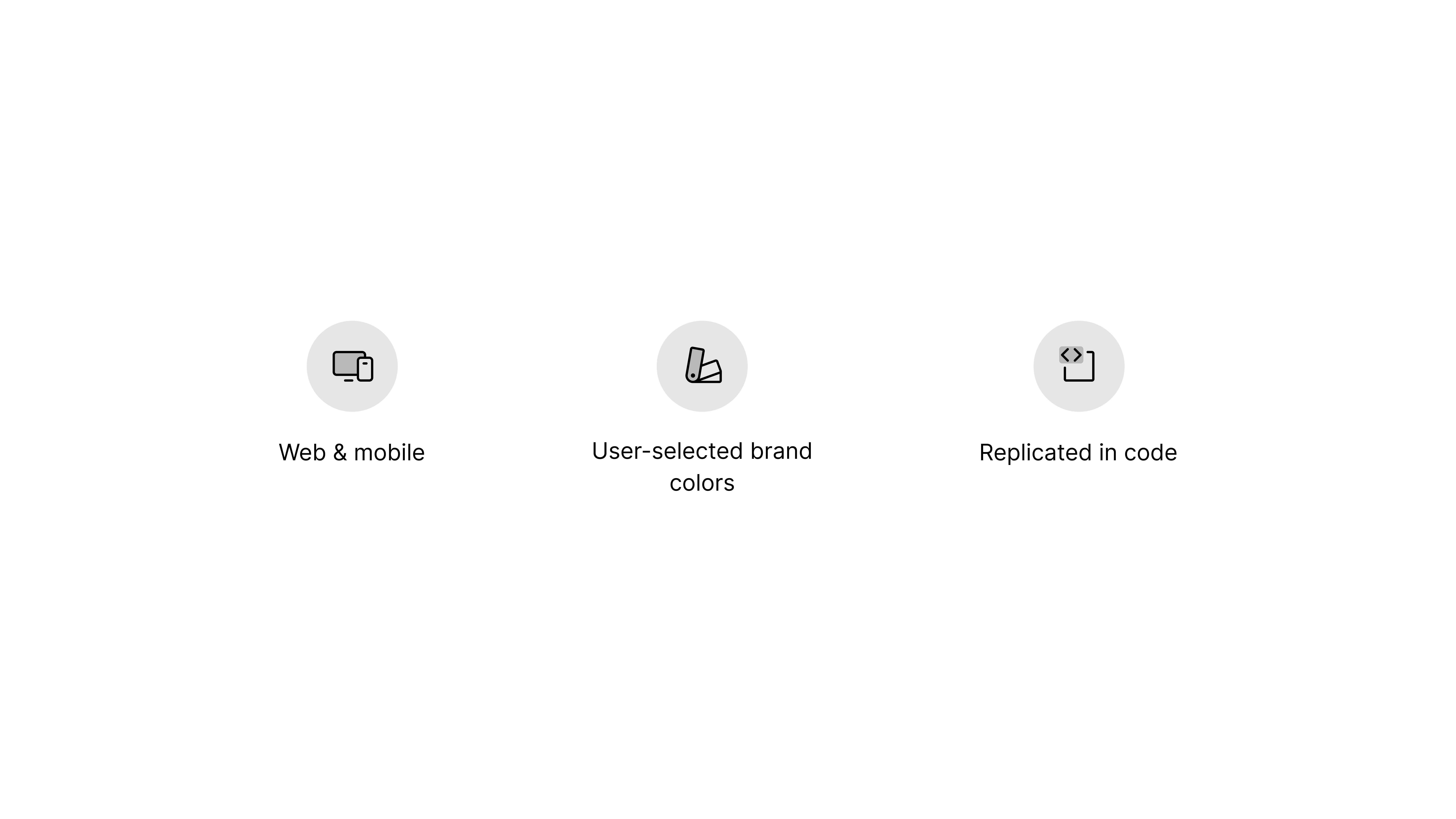
DialAfrika needed a modular, scalable UI. The styles and components we built needed to meet the following constraints:
Usable on web and mobile.
User-selected brand colors on CTAs and accents.
Replicated in code to ensure the final product matches the design.
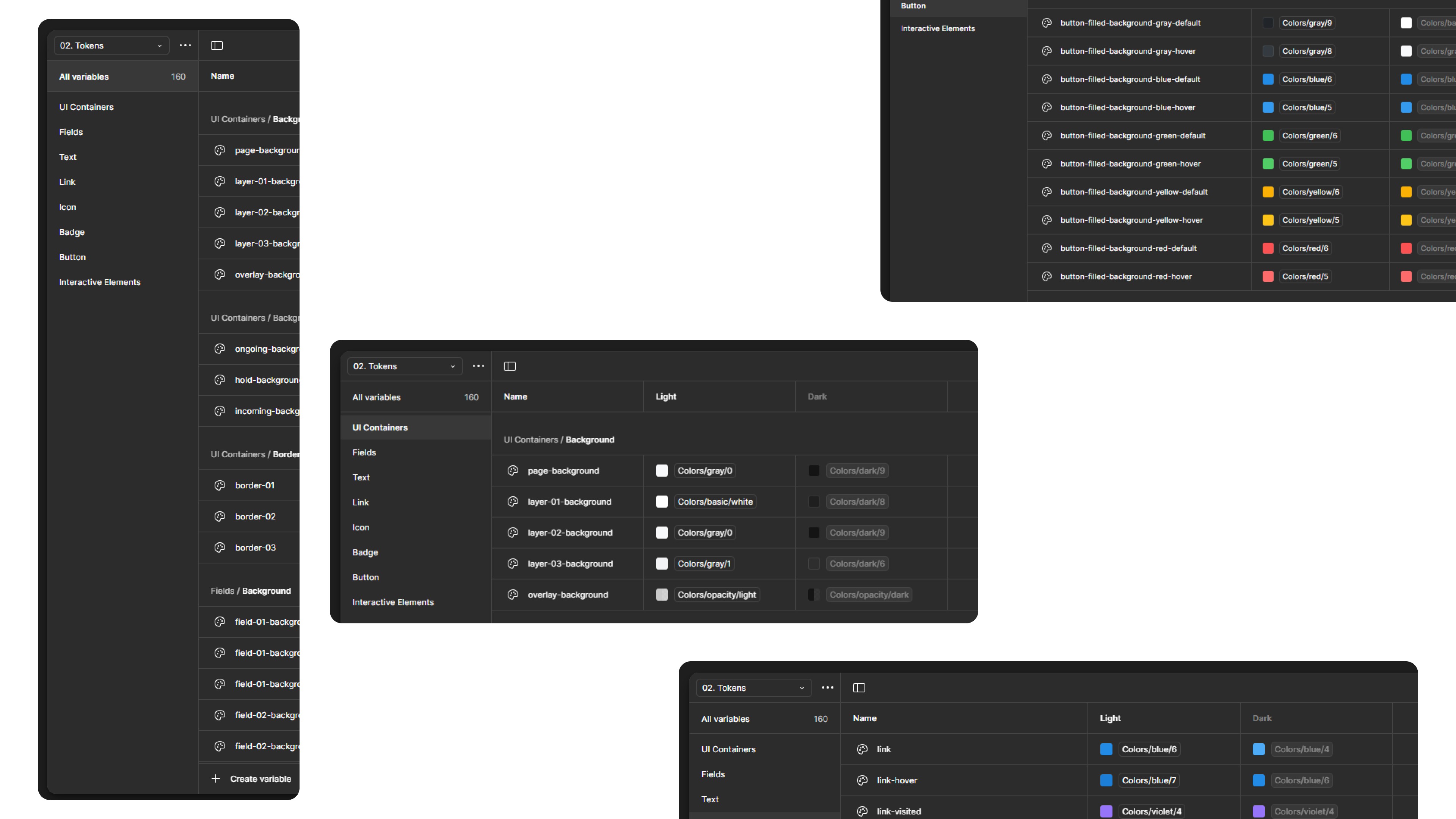
Style Primitives
We started off by assigning basic Mantine color, typography and spacing specs to Figma variables. This formed our single source of truth for all UI styles.

Style tokens
These color variables were then assigned to tokens to be used for different sections of the UI.
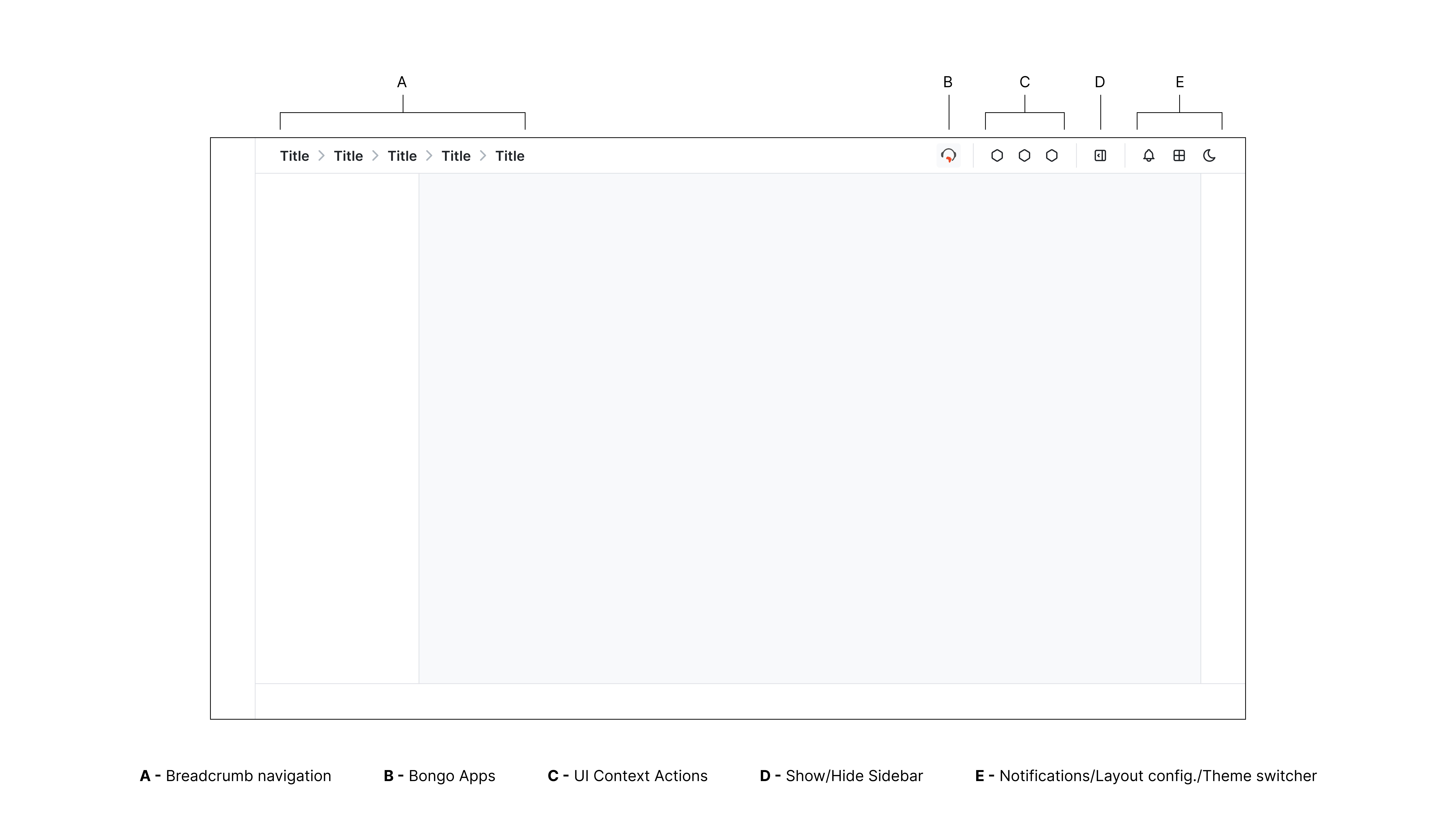
UI Navigation Structure
There are 11 products in the DialAfrika ecosystem, each serving a specialized function. While their purposes vary, it was essential that they all share an intuitive and familiar look and feel.
Most importantly, the core navigation design had to remain consistent across all apps, regardless of their specific function.
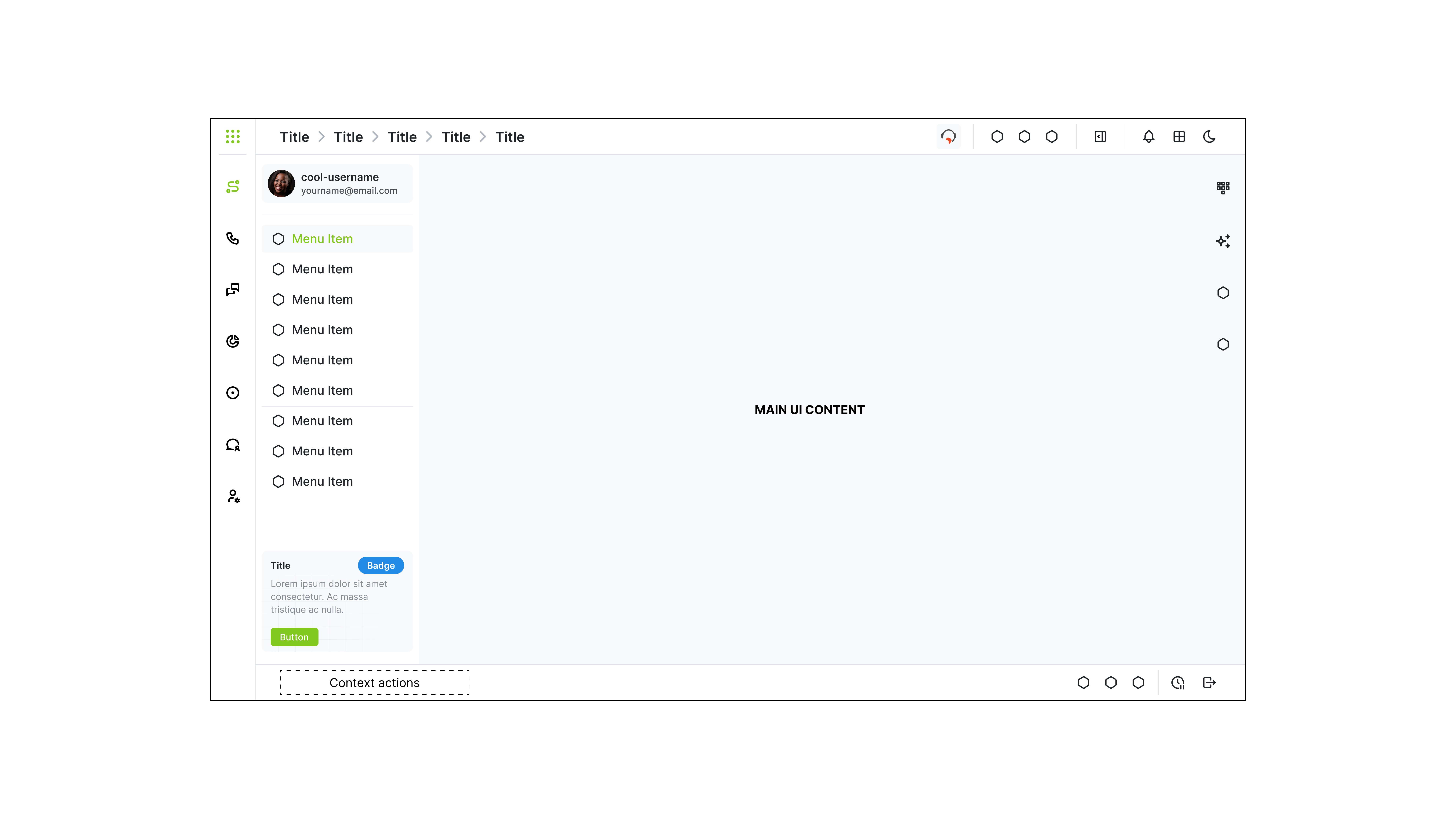
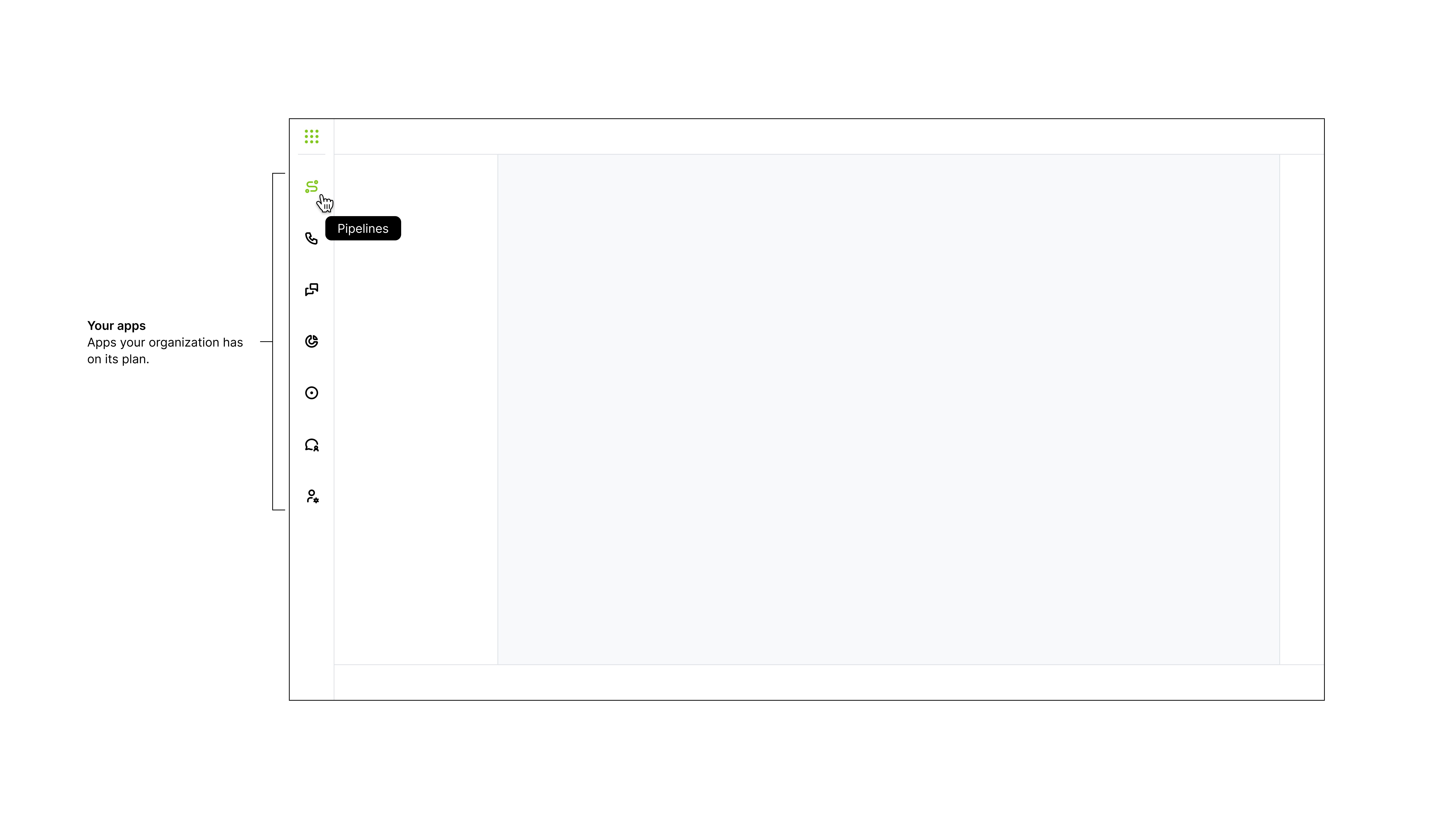
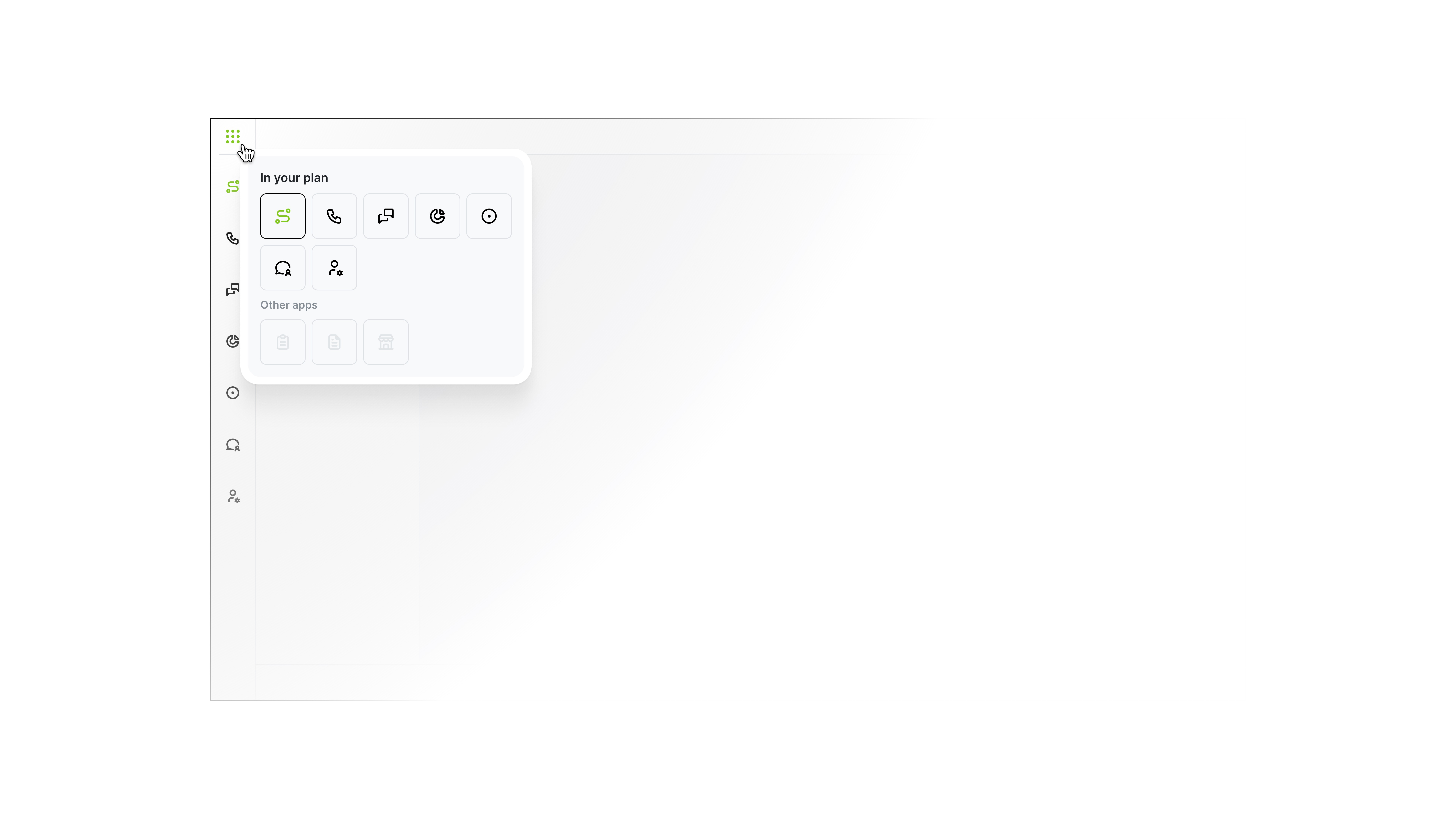
Apps Bar
This bar displays the apps included in an organization's subscription plan. Since most CX functions involve switching between tools, it remains constantly visible and easily accessible to users.
Primary Sidebar
This navigation element is platform-specific, serving as the main menu for accessing features and actions within the selected platform.

Primary Header
The primary header enables users to navigate between screens, access key UI actions, adjust layouts, view notifications, and switch between light and dark mode.
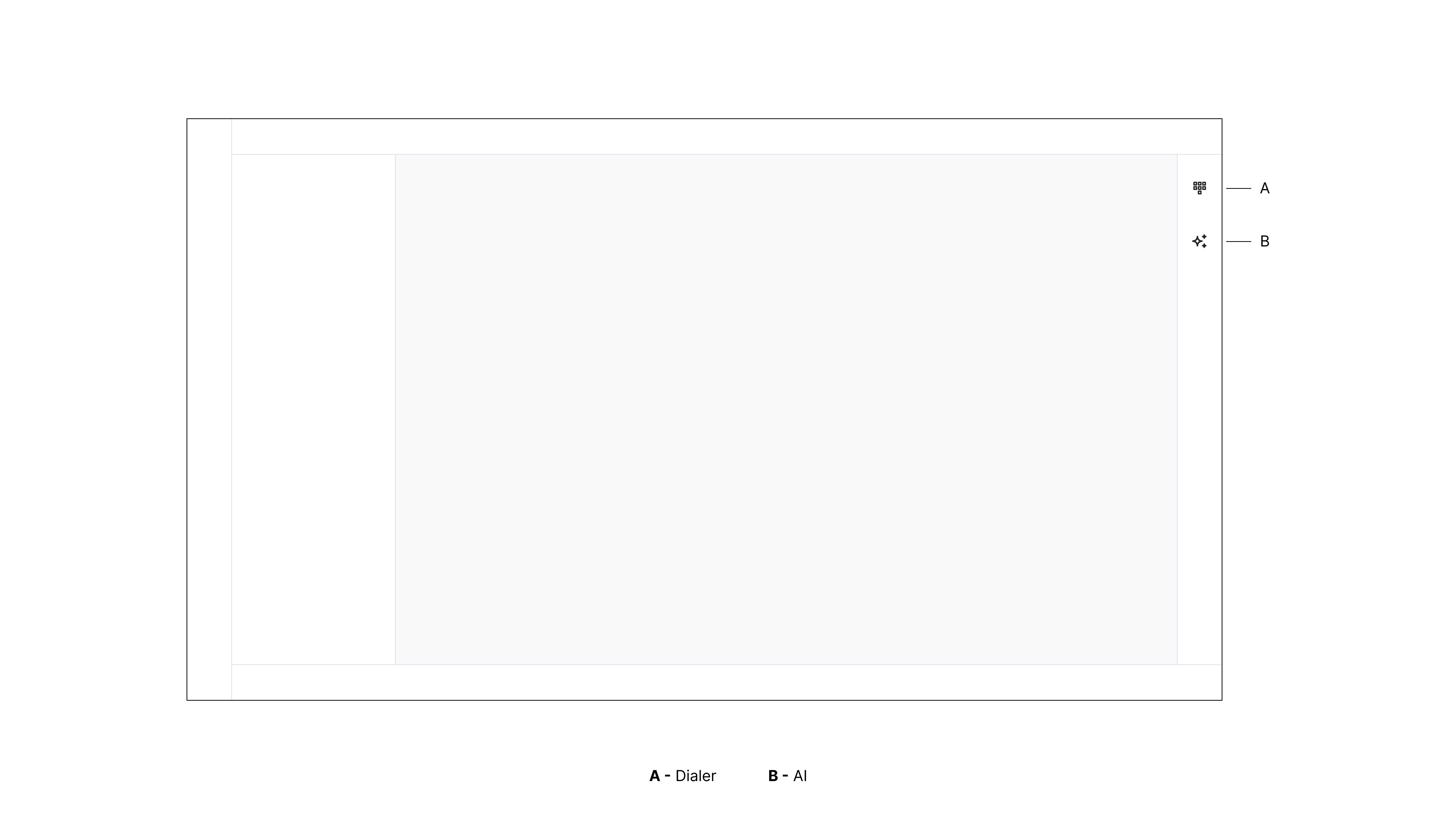
Secondary Sidebar
The secondary sidebar is also always visible, providing quick access to functionality shared across all platforms and frequently used by agents—such as the dialer for customer calls and Nia, the DialAfrika AI assistant.
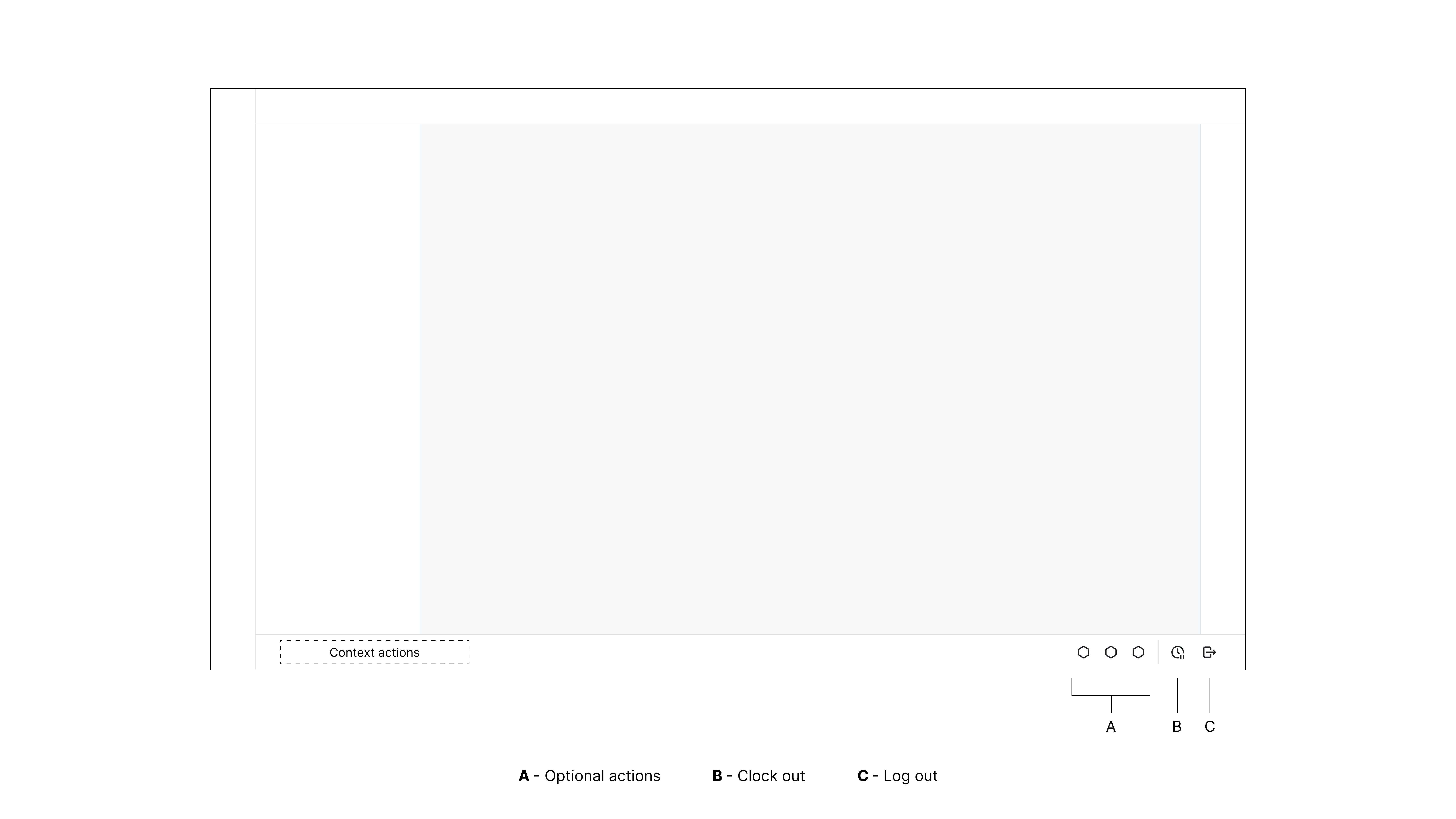
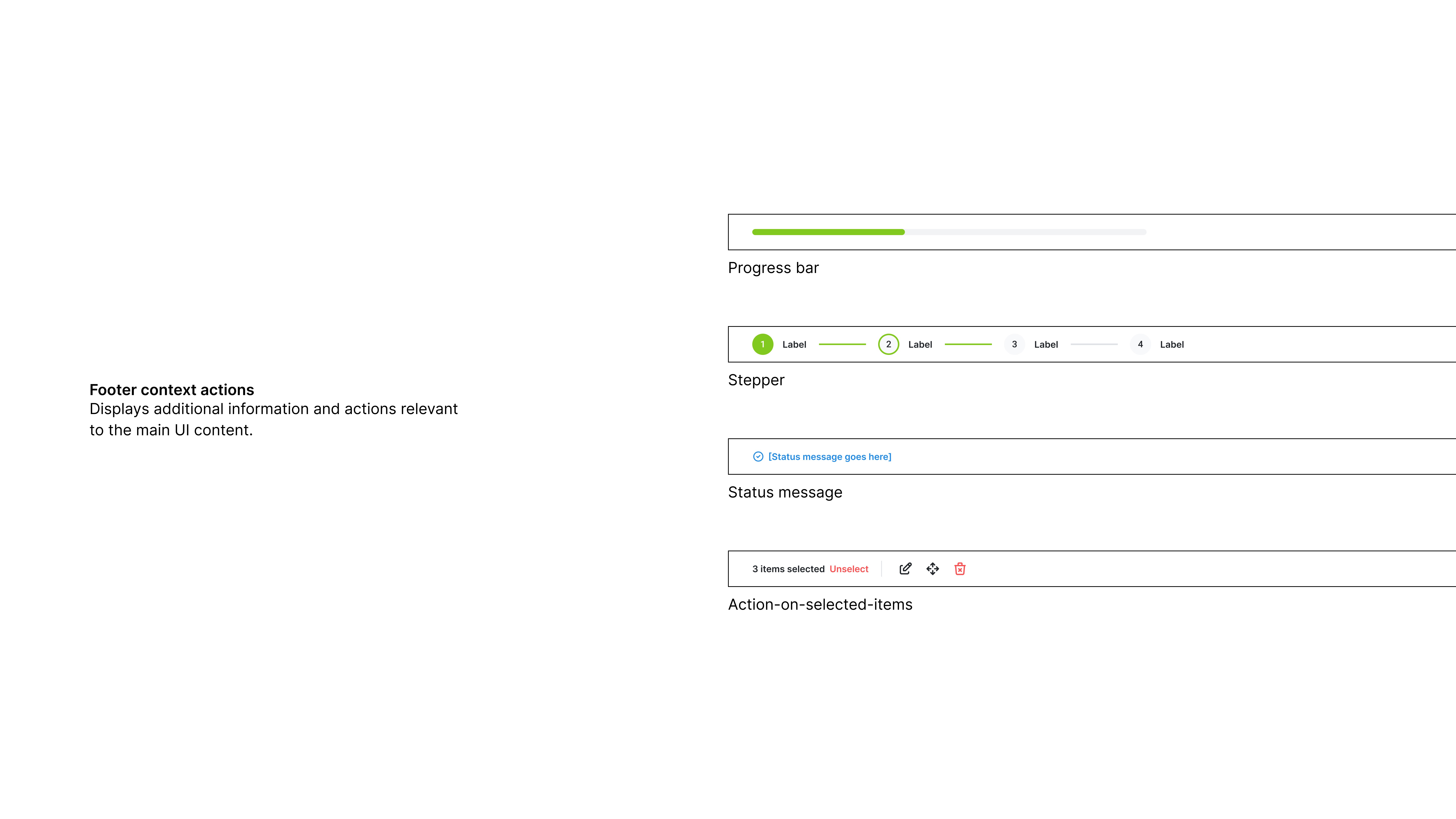
Footer
The footer provides users with context-specific actions based on the main UI container. There are also three additional slots for UI actions and the following permanent actions:
Clock Out: Remain logged in while appearing offline — a quick action for agents taking a break or handling an issue.
Log Out: Completely exit the system and end the current session.